An original menu on the home page
The originality of the menu of a website is achieved by integrating to the design and with dynamism added by special effects, popup submenus...
You can even make a menu in Flash if the site addresses entertainment amateurs, while such graphical effects are annoying for those who are searching answers on the Web ...
Static menus
Simple links to folders and files on the site, they are better suited to documentary content and blogs that can improve access with a tag cloud on the home page, a list of recent posts, etc ...
Dynamic menus
Made in JavaScript, they are drop-down menus or menus that appear when the mouse passes over an icon. Useful when a site has a lot of directories.
In this case
the links are not taken into account by search engines, which did no harm if they exist elsewhere or if the site has a registered sitemap.
Flash menus
Very impressive, dynamic and normally aesthetic they give a favorable impression on the site.
But they have the drawback of slow loading when the code is awesome, incompatibility with some computers.
In addition, Flash is not very compatible with mobile devices which now represent a large proportion of visits.
10 examples of original menus
Apple.com |
|
 |
 |
Porsche.com |
|
 |
 |
Acko.net |
|
 |
 |
Happycog.com |
|
 |
 |
DFW-UPA.org |
|
 |
 |
Creasenso.fr |
|
 |
 |
Duartepires.com |
|
 |
 |
Gloobs.com |
|
 |
 |
Notforgottenmovie.com |
|
 |
 |
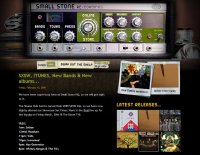
Smallstone.com |
|
 |
 |
All these beautiful menus have a drawback, however: their aesthetic is totally ignored by search engines! The design does not replace the text content and it is no coincidence that the most impressive are on web design sites...
See also : Cover Flow, used by Apple's menu.

