CSS: Common issues about alignment and other tips
Solution to common problems encountered with style sheets, mainly for the layout.
- How to center the page horizontally?
- A simple solution is given by the W3C specification. When the properties margin-left and margin-right are set to auto, the content is centered horizontally. So to center the entire page, you must create a global layer containing all the other (this does not work on body) and assign it this property:
This can apply also to any page element.#outer { margin:0 auto;} - How to center an element in a HTML page?
- With this simple CSS code, compatible with any browser since IE8:
The dimensions may be absolute or a percentage. This can be used to create a lightbox with a display:none property that may dynamically be changed to display:block..centered { position:absolute; margin:auto; top:0; left:0; bottom:0; right: 0; height:50%;
width:50%; } - How to customize the background image to the size of the screen?
- When the screen resolution is too large, the image can not fill it. In fact it is impossible to have an image that fits all screens. All solutions have their drawbacks. For example you can resize the image to the screen, but you lose quality on larger ones.
One solution is to give the image a color background that is the same as that of <body> (or vice versa) and center it. So it always seem to fill the screen! - How to vertically align the content of an element?
-

- How to fill the space with a div tag?
-
When we assign a height of 100% to a layer, the layer fills the space that contains it. The problem is that if we add another element, they will overflow the layer that contains them. With overflow:hidden, a part will be hidden.
So how to fill the space of a container? Without using a fixed height, because it must be adapted to the size of the window, that the user could change. The solution is to give a property padding-bottom to the container layer, whose height is that the second element. Example:
If you want to keep the height of the container, add the box-sizing property, as shown on this page.<div style="padding:bottom:10px"> <div style="height:100%"></div> <div style="height:10px"></div> </div>
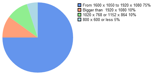
The padding reduce the 100% by the height indicated that then makes room for the second element and prevents overflow. - What screen size to consider for desktop browser?
- The page width is defined according to the most common screen size. Stats provided by StatCounter for May 2012 indicate that the 1600x1050 and 1920x1080 resolutions are the most common.


